The User SVG tool
1.0.0 · Output ·
The User SVG tool makes it possible to add (external) SVGs, JPGs and PNGs ( 1.0.0-rc.3) to your card.
1.0.0-rc.3 It has also support for clipping and masking, so your external SVG/JPG/PNG will fit the area (from rectangle/square to round) it is displayed within.
| Weather | Weather | AirVisual | AirVisual |
|---|---|---|---|
 |  |  |  |
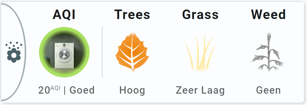
An example using clipping and masking: A square image of a washing machine is now fit to the round circle. Furthermore, all images and svgs have an opacity mask.
Inline SVG support is foreseen in the future
Basic usage
| From: view-sake6 | |
|---|---|
1 2 3 4 5 6 7 8 9 | |
This one is taken from example 1, the display of the 'face' used for AirVisual.
| From: view-sake1 | |
|---|---|
1 2 3 4 5 6 7 8 9 10 11 12 13 14 15 16 17 18 19 20 21 22 23 24 25 26 27 28 29 30 31 32 | |
Advanced usage
This example shows how to clip/mask an image or svg.
| From: view-sake1 | |
|---|---|
1 2 3 4 5 6 7 8 9 10 11 12 13 14 15 16 17 18 19 20 21 22 23 24 25 26 27 28 29 30 31 32 33 34 35 36 37 38 39 40 41 42 43 44 45 46 47 | |
Styling
As of 2.4.2, styling of external SVG is possible (again)
The User SVG tool has support for the following forms of styling:
| Method | Support | Description |
|---|---|---|
classes | Using SAK or User defined class definitions | |
styles | Using inline SVG and CSS styles |
For styling to work, the external SVG must be suitable to get styled
See: Make pollen SVGs stylable
Things that must be removed in the SVG to allow for external styling are:
- Inline style definitions
- Inline class definitions in the
section of the SVG
Things that do work are:
- Usage of class definitions wich can be overridden externally
- Usage of CSS variables which can be set externally
Safari has problems with certain styling
- CSS Filters don't work. Use SVG filters instead!
- Also, chaining filters in Safari does NOT work. Use combined SVG filters instead.
- For any other Safari problem where things work in Chrome: wait for the new SVG engine

The User SVG tool is composed of a single object: "usersvg" and this is the selector for styling:
1 2 3 4 5 6 7 8 9 10 | |
| Property | Does what? | Example |
|---|---|---|
| opacity | Makes image transparent | opacity: 0.5 (for 50% opacity) |
Styling: Injected vs external SVGs
External SVGs can't be styled, so-called 'injected' SVGs can be styled.
The default behaviour of the User SVG tool is to 'inject' the external SVGs into the tool.
However, if the SVG contains local styling and class definitions, and the same SVG is used more than once in a card, you can run into styling problems (internal classes overwrite each other), and you have to force the SVGs to remain external images.
This can be done as follows:
  options:
    svginjection: false     # true (default) for injection,
                            # false for keeping the external file
Haptics
See: https://companion.home-assistant.io/docs/integrations/haptics/ for devices that support haptics
The tool supports haptic feedback through user_actions/ tap_action definition
| Action | Haptic | Description |
|---|---|---|
| Click | haptic | Uses the haptic property defined in the user_actions definition of the tool. If not specified, a default of medium is used |
1 2 3 4 5 6 7 8 9 10 11 12 13 | |
Possible values for haptic feedback:
| Haptic | Description |
|---|---|
| success | Indicates that a task or action has completed. |
| warning | Indicates that a task or action has produced a warning of some kind. |
| failure | Indicates that a task or action has failed. |
| light | Provides a physical metaphor that complements the visual experience. |
| medium | Provides a physical metaphor that complements the visual experience. |
| heavy | Provides a physical metaphor that complements the visual experience. |
| selection | Indicates that the selection is actively changing. |
Animations
The User SVG tool has support for the following forms of animations:
| Method | Support | Description |
|---|---|---|
colorstops | List of state values to set the color | |
colorlists | Using a colorlist definition | |
animations | Operator state based animations with class/style styling |
The use of animations require the tool to be connected to an entity
Detailed specification
The basic and advanced usage shows all the functionalities of the User SVG tool.