Skip to content

The Switch tool

1.0.0 · Input

The Switch tool is based on two SVG basic <rectangle> element shapes.
It is a composite tool with a built-in animation to move the thumb to 'off' or 'on' position and to change the color to 'off' or 'on' color.

Basic usage

1
2
3
4
5
6
- type: 'switch'              # tooltype is 'switch'
  position:                   # Position on (100x100) canvas
    cx: 50                    # cx=50 is center position
    cy: 50                    # cy=50 is center position
    orientation: 'horizontal' # Vertical or horizontal
  entity_index: 0

The switch tool must ALWAYS be connected to an 'on' / 'off' state entity.

Lights and Switches are the most used entities for this tool.

Extended usage

The Switch tools parts can be defined/styled individually.

 1
 2
 3
 4
 5
 6
 7
 8
 9
10
11
12
13
14
15
16
17
18
19
20
21
22
23
- type: switch
  position:
    cx: 50
    cy: 50
    track:                    # Configure track part
      radius: 1               # Round corners with radius=1
    thumb:                    # Configure thumb part
      width: 5                # Set width
      height: 5               # Set height
      radius: 1               # Set corner radius
      offset: 2.5             # offset = width/2 for on/off move
    orientation: 'horizontal'
  entity_index: 0
  animations:
    - state: 'on'             # Define thumb colors when 'on'
      id: 1
      styles:
        thumb:
          --thumb-stroke: 'var(--primary-background-color)'
          fill: 'var(--switch-checked-button-color)'
  styles:
    thumb:                    # Overwrite thumb setting
      --thumb-stroke: 'var(--primary-background-color)'

Style the switch to round or square

By specifying both the track and the thumb sizes and corner radius, you can create completely different switches.

Styling

The Switch tool has support for the following forms of styling:

Method Support Description
classes Using SAK or User defined class definitions
styles Using inswitch SVG and CSS styles

The Switch tool is composed of two parts: "track" and "thumb" can be used as the selector for styling:

 1
 2
 3
 4
 5
 6
 7
 8
 9
10
11
12
13
14
15
16
- type: 'switch'
  position:
    cx: 50
    cy: 50
    orientation: 'vertical'
  entity_index: 0
  classes:
    track:                    # Track selector
      <...>
    thumb:                    # Thumb selector
      <...>
  styles:
    track:                    # Track selector
      <...>
    thumb:                    # Thumb selector
      <...>

Populair properties:

Property Does what? Example

Haptics

The tool supports haptic feedback through user_actions/ tap_action definition

Action Haptic Description
Click haptic Uses the haptic property defined in the user_actions definition of the tool. If not specified, a default of medium is used
 1
 2
 3
 4
 5
 6
 7
 8
 9
10
11
12
13
  tools:
    - type: icon
      position:
        cx: 10
        cy: 10
        align: center
        icon_size: 15
      entity_index: 0
      user_actions:
        tap_action:
          haptic: success
          actions:
            - action: more-info

Possible values for haptic feedback:

Haptic Description
success Indicates that a task or action has completed.
warning Indicates that a task or action has produced a warning of some kind.
failure Indicates that a task or action has failed.
light Provides a physical metaphor that complements the visual experience.
medium Provides a physical metaphor that complements the visual experience.
heavy Provides a physical metaphor that complements the visual experience.
selection Indicates that the selection is actively changing.

Animations

The Switch tool has support for the following forms of animations:

Method Support Description
colorstops List of state values to set the color
colorlists Using a colorlist definition
animations Operator state based animations with class/style styling

Examples

Some examples with different settings in 'off' and 'on' state.

sak-switch-example

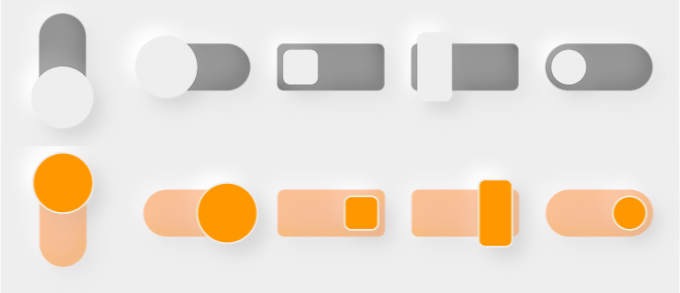
From left to right, the partial configuration is as follows:

 1
 2
 3
 4
 5
 6
 7
 8
 9
10
11
12
13
14
15
16
17
18
19
20
21
22
23
24
25
26
27
28
29
30
31
32
33
34
35
36
37
38
39
40
41
42
43
44
45
46
47
48
- type: switch                    # #1
  position:
    cx: 60
    cy: 30
    orientation: 'vertical'

- type: switch                    # #2
  position:
    cx: 80
    cy: 30
    orientation: 'horizontal'

- type: switch                    # #3
  position:
    cx: 100
    cy: 30
    track:
      radius: 1
    thumb:
      width: 5
      height: 5
      radius: 1
      offset: 2.5
    orientation: 'horizontal'

- type: switch                    # #4
  position:
    cx: 120
    cy: 30
    track:
      radius: 1
    thumb:
      width: 5
      height: 10
      radius: 1
      offset: 2.5
    orientation: 'horizontal'

- type: switch                    # #5
  position:
    cx: 140
    cy: 30
    orientation: 'horizontal'
    thumb:
      width: 5
      height: 5
      radius: 2.5
      offset: 2.5

Ramblings

Just thoughts, nothing more, to extend the switch with some decorators orso: you can define extra basic SVG elements to 'decorate' the track and thumb part of the switch...

 1
 2
 3
 4
 5
 6
 7
 8
 9
10
11
12
13
14
15
16
17
18
19
20
21
22
23
24
25
26
27
28
29
30
31
32
33
34
- type: switch
  position:
    cx: 50
    cy: 50
    track:                    # Configure track part
      radius: 1               # Round corners with radius=1
    thumb:                    # Configure thumb part
      width: 5                # Set width
      height: 5               # Set height
      radius: 1               # Set corner radius
      offset: 2.5             # offset = width/2 for on/off move
    orientation: 'horizontal'
  entity_index: 0
  decorators:
    thumb:
      - type: circle          # Place a circle on top of the thumb
        name: dot             # name it 'dot' used for selections
        position:
          cx: 50              # center it on the thumb
          cy: 50
          radius: 2           # small one, its called a 'dot'...
  animations:
    - state: 'on'             # Define thumb colors when 'on'
      id: 1
      styles:
        thumb:
          --thumb-stroke: 'var(--primary-background-color)'
          fill: 'var(--switch-checked-button-color)'
        thumb.dot:
          stroke: red

  styles:
    thumb:                    # Overwrite thumb setting
      --thumb-stroke: 'var(--primary-background-color)'