Tools Tool Circular Slider
The circular slider tool is an input tool with configurable track, active track, thumb and label position and styling. The difference with this slider and the other slider is that this one is circular and the other is either vertical or horizontal.
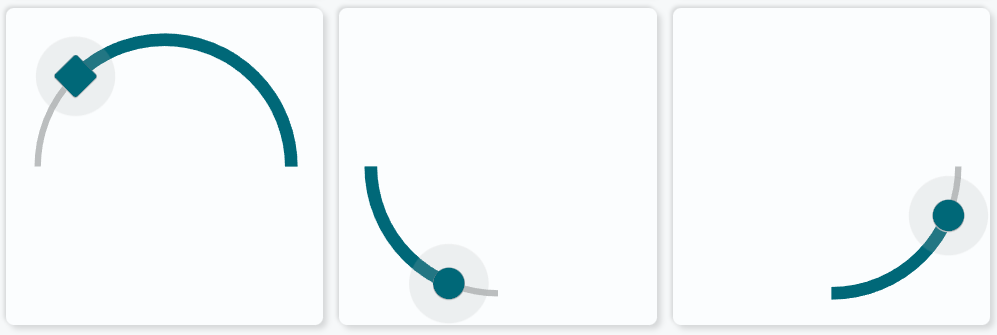
Basic usageExample with default styling settings.
 1
 2
 3
 4
 5
 6
 7
 8
 9
10
11
12
13
14
15
16
17
18
19
20
21
22
23
24
25
26
27
28
29
30
31
32
33
34
35
36
37
38
39
40
41
42
43
- type : 'custom:swiss-army-knife-card'
entities :
- entity : light.livingroom_light_duo_right_light
attribute : brightness
unit : "%"
format : brightness
aspectratio : 1/1 # Card is 100x100 grid
layout :
toolsets :
# ================================================================
- toolset : circ-slider-test # Just a name
position :
cx : 50 # Center on card
cy : 50
tools :
# ------------------------------------------------------------
- type : circslider
position :
cx : 50 # Center on toolset
cy : 50
radius : 40
start_angle : -90
end_angle : -180
entity_index : 0
user_actions :
drag_action :
update_interval : 200 # Update every 200msec
haptic : selection
actions :
- action : call-service
service : light.turn_on
parameter : brightness_pct
tap_action :
haptic : light
actions :
- action : call-service
service : light.turn_on
parameter : brightness_pct
scale :
min : 1 # From 1..100
max : 100
step : 1 # 1 step at a time
StylingThe circular slider tool has support for the following forms of styling:
Method Support Description classesUsing SAK or User defined class definitions stylesUsing inslider SVG and CSS styles
The circular slider tool is composed of four parts: "track", "active", "thumb" and "label" + "uom" can be used as the selector for styling:
 1
 2
 3
 4
 5
 6
 7
 8
 9
10
11
12
13
14
15
16
17
18
19
20
21
22
23
24
25
26
27
28
29
30
- type : 'arcslider'
position :
cx : 50
cy : 50
radius : 40
start_angle : -90
end_angle : -180
entity_index : 0
classes :
track : # Track selector
<...>
active : # Active track selector
<...>
thumb : # Thumb selector
<...>
label : # Label selector
<...>
uom : # Unit of label selector
<...>
styles :
track : # Track selector
<...>
active : # Active track selector
<...>
thumb : # Thumb selector
<...>
label : # Label selector
<...>
uom : # Unit of label selector
<...>
The capture area is normally hidden, but can be styled by the user, just as the other parts:
Look at the 3 examples below for more extensive styling.
HapticsThe circular slider supports its own haptic feedback in the user_actions part.
Action Haptic Description Click slider in config Feedback that slider is clicked Drag slider in config Feedback for every update to HA of the slider value
AnimationsThe circular slider tool has support for the following forms of animations:
Method Support Description colorstopsList of state values to set the color colorlistsUsing a colorlist definition animationsOperator state based animations with class/style styling
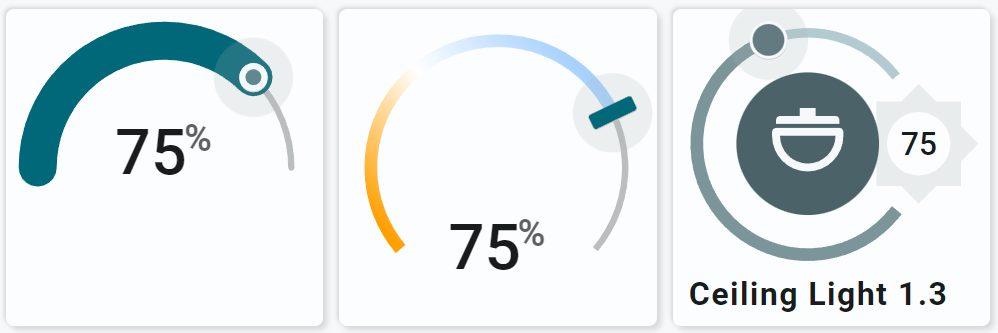
Examples 1.1 to 1.3Some examples with different settings for track and thumb.
The examples show the capture area too around the thumb: that one is normally hidden, but can be styled by the user!
YAML Definitions
Example 1.1 YAML definition 1
2
3
4
5
6
7
8
9
10
11
12
13
14
15
16
17
18
19
20
21
22
23
24
25
26
27
28
29
30
31
32
33
34
35
36
37
38
39
40
41
42
43
44
45
46
47
48
49
50
51
52
53
54
55
56
57
58
59
60
61
62
63
64
65
66
67
68
69
70
71
72
73
74
75
76
77
78
79
80
81
82
83 # 1.1 ###################################################################
- type : 'custom:swiss-army-knife-card'
entities :
- entity : light.livingroom_light_duo_right_light
name : 'CircSlider Test'
- entity : light.livingroom_light_duo_right_light
attribute : brightness
unit : "%"
format : brightness
aspectratio : 1/1 # Card is 100x100 grid
layout :
styles :
card :
toolsets :
# ================================================================
- toolset : circ-slider-test
position :
cx : 50
cy : 50
tools :
# ------------------------------------------------------------
- type : circslider
position :
cx : 50
cy : 50
radius : 40
start_angle : -90
end_angle : 90
label :
placement : 'position'
cx : 50
cy : 45
thumb :
width : 7
height : 7
entity_index : 1
user_actions :
drag_action :
update_interval : 200 # Update every 200msec
haptic : selection
actions :
- action : call-service
service : light.turn_on
parameter : brightness_pct
tap_action :
haptic : light
actions :
- action : call-service
service : light.turn_on
parameter : brightness_pct
scale :
min : 1
max : 100
step : 5
show :
uom : 'end'
styles :
circslider :
stroke : none
fill : none
label :
text-anchor : middle
font-size : 20em
font-weight : 500
pointer-events : auto
uom :
font-weight : 600
active :
stroke : var(--theme-sys-color-primary)
stroke-width : 12em
stroke-linecap : round
track :
stroke : var(--theme-sys-elevation-surface-neutral4)
fill-opacity : 1
stroke-width : 2em
stroke : var(--theme-sys-elevation-surface-neutral10)
stroke-linecap : round
thumb :
fill : var(--theme-sys-color-primary)
fill-opacity : 0.7
stroke : var(--primary-background-color)
stroke-width : 2em
Example 1.2 YAML definition 1
2
3
4
5
6
7
8
9
10
11
12
13
14
15
16
17
18
19
20
21
22
23
24
25
26
27
28
29
30
31
32
33
34
35
36
37
38
39
40
41
42
43
44
45
46
47
48
49
50
51
52
53
54
55
56
57
58
59
60
61
62
63
64
65
66
67
68
69
70
71 # 1.2 ###################################################################
- type : 'custom:swiss-army-knife-card'
entities :
- entity : light.livingroom_light_duo_right_light
name : 'CircSlider Test'
- entity : light.livingroom_light_duo_right_light
attribute : brightness
unit : "%"
format : brightness
aspectratio : 1/1 # Card is 100x100 grid
layout :
styles :
card :
toolsets :
# ================================================================
- toolset : circ-slider-test
position :
cx : 50
cy : 50
tools :
# ------------------------------------------------------------
- type : circslider
position :
cx : 50
cy : 50
radius : 40
start_angle : -130
end_angle : 130
thumb :
width : 5
height : 15
radius : 1
label :
placement : 'position'
cx : 50.01
cy : 75
entity_index : 1
user_actions :
drag_action :
update_interval : 200 # Update every 200msec
haptic : selection
actions :
- action : call-service
service : light.turn_on
parameter : brightness_pct
tap_action :
haptic : light
actions :
- action : call-service
service : light.turn_on
parameter : brightness_pct
scale :
min : 1
max : 100
step : 1
styles :
circslider :
stroke : none
fill : var(--theme-sys-elevation-surface-neutral4)
active :
stroke : var(--theme-sys-color-primary)
stroke : url(#sak-light-color-temperature-gradient)
label :
text-anchor : middle
font-size : 20em
font-weight : 500
pointer-events : auto
uom :
font-weight : 600
Example 1.3 YAML definition 1
2
3
4
5
6
7
8
9
10
11
12
13
14
15
16
17
18
19
20
21
22
23
24
25
26
27
28
29
30
31
32
33
34
35
36
37
38
39
40
41
42
43
44
45
46
47
48
49
50
51
52
53
54
55
56
57
58
59
60
61
62
63
64
65
66
67
68
69
70
71
72
73
74
75
76
77
78
79
80
81
82
83
84
85
86
87
88
89
90
91
92
93
94
95
96
97
98
99
100
101
102
103
104
105
106
107
108
109
110
111
112
113
114
115
116
117
118
119
120
121
122
123
124
125
126
127
128
129
130
131
132
133
134
135
136
137
138
139
140
141
142
143
144
145
146
147
148
149
150
151
152
153
154
155
156
157
158
159
160
161
162
163
164
165
166
167
168
169
170
171
172
173
174 # 1.3 ###################################################################
- type : 'custom:swiss-army-knife-card'
entities :
- entity : light.livingroom_light_duo_right_light
name : 'Ceiling Light 1.3'
icon : mdi:dome-light
- entity : light.livingroom_light_duo_right_light
attribute : brightness
unit : "%"
format : brightness
aspectratio : 1/1 # Card is 100x100 grid
layout :
styles :
card :
toolsets :
# ================================================================
- toolset : circ-slider-test
position :
cx : 42.5
cy : 42.5
tools :
# ------------------------------------------------------------
# Icon with percentage in it
- type : icon
position :
cx : 85
cy : 50
align : center
icon_size : 40
entity_index : 0
icon : mdi:brightness-5
animations :
- state : 'on'
styles :
icon :
fill : var(--theme-sys-elevation-surface-neutral4)
- state : 'off'
styles :
icon :
fill : none
styles :
icon :
fill : var(--theme-sys-elevation-surface-neutral4)
transition : fill 1s ease
# ------------------------------------------------------------
- type : circslider
position :
cx : 50
cy : 50
radius : 35
start_angle : -230
end_angle : 50
label :
placement : 'position'
cx : 85
cy : 50
entity_index : 1
show :
uom : none
user_actions :
drag_action :
update_interval : 200 # Update every 200msec
haptic : selection
actions :
- action : call-service
service : light.turn_on
parameter : brightness_pct
tap_action :
haptic : light
actions :
- action : call-service
service : light.turn_on
parameter : brightness_pct
scale :
min : 1
max : 100
step : 1
styles :
circslider :
stroke : none
fill : var(--theme-sys-elevation-surface-neutral4)
filter : drop-shadow(1px 4px 6px black)
active :
stroke : var(--theme-sys-palette-secondary60)
stroke-width : 4em
stroke-linecap : square
track :
stroke : var(--theme-sys-palette-secondary80)
stroke-width : 3em
stroke-linecap : square
card :
-cs-theme-shadow-darker : auto
thumb :
fill : var(--theme-sys-palette-secondary50)
stroke : var(--primary-background-color)
stroke-width : 2em
paint-order : stroke
label :
text-anchor : middle
font-size : 10em
font-weight : 500
pointer-events : auto
uom :
font-weight : 600
# ------------------------------------------------------------
# Circle as button
- type : circle
position :
cx : 50
cy : 50
radius : 22.5
entity_index : 0
animations :
- state : 'on'
styles :
circle :
fill : var(--theme-sys-palette-secondary40)
- state : 'off'
styles :
circle :
fill : var(--theme-sys-palette-secondary80)
user_actions :
tap_action :
haptic : light
actions :
- action : call-service
service : light.toggle
styles :
circle :
fill : var(--theme-sys-color-secondary-container)
stroke : var(--theme-sys-color-secondary)
stroke-width : 0em
transition : fill 1s ease
# ------------------------------------------------------------
- type : icon
position :
cx : 50
cy : 50
align : center
icon_size : 30
entity_index : 0
animations :
- state : 'on'
styles :
icon :
fill : var(--primary-background-color)
- state : 'off'
styles :
icon :
fill : var(--theme-sys-color-secondary)
styles :
icon :
fill : var(--theme-sys-color-secondary)
pointer-events : none
transition : fill 1s ease
# ================================================================
- toolset : name
position :
cx : 5
cy : 90
tools :
# ------------------------------------------------------------
- type : name
position :
cx : 50
cy : 50
entity_index : 0
styles :
name :
font-size : 10em
text-anchor : start
font-weight : bold
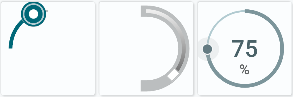
Examples 1.4 to 1.6Some more examples with different settings for track and thumb.
Example 1.4 shows formatting the capture area. 1.5 has capture hidden!
If you use a 360 degree circular slider, the tool blocks max/min and min/max transitions!
You can drag the thumb to the maximum or minimum value without having to stop exactly at the right point.
YAML Definitions
Example 1.4 YAML definition 1
2
3
4
5
6
7
8
9
10
11
12
13
14
15
16
17
18
19
20
21
22
23
24
25
26
27
28
29
30
31
32
33
34
35
36
37
38
39
40
41
42
43
44
45
46
47
48
49
50
51
52
53
54
55
56
57
58
59
60
61
62
63
64
65
66
67
68 # 1.4 ###################################################################
- type : 'custom:swiss-army-knife-card'
entities :
- entity : light.livingroom_light_duo_right_light
name : 'CircSlider Test'
- entity : light.livingroom_light_duo_right_light
attribute : brightness
unit : "%"
format : brightness
aspectratio : 1/1 # Card is 100x100 grid
layout :
styles :
card :
toolsets :
# ================================================================
- toolset : circ-slider-test
position :
cx : 50
cy : 50
tools :
# ------------------------------------------------------------
- type : circslider
position :
cx : 50
cy : 50
radius : 40
start_angle : 270
end_angle : 360
entity_index : 1
animations :
- state : '[[[ return state; ]]]'
styles :
thumb :
stroke-width : '[[[ return (2 + ( state / 10)) + "em"; ]]]'
user_actions :
drag_action :
update_interval : 200 # Update every 200msec
haptic : selection
actions :
- action : call-service
service : light.turn_on
parameter : brightness_pct
tap_action :
haptic : light
actions :
- action : call-service
service : light.turn_on
parameter : brightness_pct
scale :
min : 1
max : 100
step : 1
styles :
circslider :
stroke : none
fill : var(--theme-sys-elevation-surface-neutral4)
thumb :
stroke : var(--theme-sys-color-primary)
fill : white
paint-order : stroke
capture :
stroke-width : 2em
stroke : var(--theme-sys-color-primary)
fill : var(--theme-sys-color-secondary)
fill : var(--theme-sys-palette-secondary80)
fill-opacity : 1
Example 1.5 YAML definition 1
2
3
4
5
6
7
8
9
10
11
12
13
14
15
16
17
18
19
20
21
22
23
24
25
26
27
28
29
30
31
32
33
34
35
36
37
38
39
40
41
42
43
44
45
46
47
48
49
50
51
52
53
54
55
56
57
58
59
60
61
62
63
64
65
66
67
68
69 # 1.5 ###################################################################
- type : 'custom:swiss-army-knife-card'
entities :
- entity : light.livingroom_light_duo_right_light
name : 'CircSlider Test'
- entity : light.livingroom_light_duo_right_light
attribute : brightness
unit : "%"
format : brightness
aspectratio : 1/1 # Card is 100x100 grid
layout :
styles :
card :
toolsets :
# ================================================================
- toolset : circ-slider-test
position :
cx : 50
cy : 50
tools :
# ------------------------------------------------------------
- type : circslider
position :
cx : 50
cy : 50
radius : 40
start_angle : 0
end_angle : 180
thumb :
radius : 0
height : 8
width : 12
entity_index : 1
user_actions :
drag_action :
update_interval : 200 # Update every 200msec
haptic : selection
actions :
- action : call-service
service : light.turn_on
parameter : brightness_pct
tap_action :
haptic : light
actions :
- action : call-service
service : light.turn_on
parameter : brightness_pct
scale :
min : 1
max : 100
step : 1
styles :
circslider :
stroke : none
fill : var(--theme-sys-elevation-surface-neutral4)
thumb :
stroke : var(--theme-sys-elevation-surface-neutral10)
fill : white
stroke-width : 1em
track :
stroke-width : 12em
stroke-linecap : square
active :
stroke : var(--primary-background-color)
stroke : url(#sak-light-brightness-gradient)
capture :
fill : none
Example 1.6 YAML definition 1
2
3
4
5
6
7
8
9
10
11
12
13
14
15
16
17
18
19
20
21
22
23
24
25
26
27
28
29
30
31
32
33
34
35
36
37
38
39
40
41
42
43
44
45
46
47
48
49
50
51
52
53
54
55
56
57
58
59
60
61
62
63
64
65
66
67
68
69
70
71
72
73
74
75 # 1.6 ###################################################################
- type : 'custom:swiss-army-knife-card'
entities :
- entity : light.livingroom_light_duo_right_light
name : 'CircSlider Test'
- entity : light.livingroom_light_duo_right_light
attribute : brightness
unit : "%"
format : brightness
aspectratio : 1/1 # Card is 100x100 grid
layout :
styles :
card :
toolsets :
# ================================================================
- toolset : circ-slider-test
position :
cx : 50
cy : 50
tools :
# ------------------------------------------------------------
- type : circslider
position :
cx : 50
cy : 50
radius : 40
start_angle : 0
end_angle : 360
label :
placement : 'position'
cx : 50.01
cy : 50.01
entity_index : 1
show :
uom : bottom
user_actions :
drag_action :
update_interval : 200 # Update every 200msec
haptic : selection
actions :
- action : call-service
service : light.turn_on
parameter : brightness_pct
tap_action :
haptic : light
actions :
- action : call-service
service : light.turn_on
parameter : brightness_pct
scale :
min : 1
max : 100
step : 1
styles :
circslider :
stroke : none
fill : var(--theme-sys-elevation-surface-neutral4)
track :
stroke : var(--theme-sys-palette-secondary80)
active :
stroke : var(--theme-sys-palette-secondary60)
thumb :
stroke : var(--primary-background-color)
stroke-width : 2em
fill : var(--theme-sys-palette-secondary50)
paint-order : stroke
label :
text-anchor : middle
font-size : 25em
font-weight : 500
fill : var(--theme-sys-color-secondary)
uom :
font-weight : 600
Examples 2.1 to 2.3Some more examples with default styling.
These examples show the circular slider counter clock-wise (CCW)
YAML Definitions
Example 2.1 (CCW) YAML definition 1
2
3
4
5
6
7
8
9
10
11
12
13
14
15
16
17
18
19
20
21
22
23
24
25
26
27
28
29
30
31
32
33
34
35
36
37
38
39
40
41
42
43
44
45
46
47
48
49
50
51 # 2.1 ###################################################################
- type : 'custom:swiss-army-knife-card'
entities :
- entity : light.livingroom_light_duo_right_light
name : 'CircSlider Test'
- entity : light.livingroom_light_duo_right_light
attribute : brightness
unit : "%"
format : brightness
aspectratio : 1/1 # Card is 100x100 grid
layout :
styles :
card :
toolsets :
# ================================================================
- toolset : circ-slider-test
position :
cx : 50
cy : 50
tools :
# ------------------------------------------------------------
- type : circslider
position :
cx : 50
cy : 50
radius : 40
start_angle : 90
end_angle : -90
thumb :
radius : 1
entity_index : 1
user_actions :
drag_action :
update_interval : 0 # Update every 200msec
haptic : selection
actions :
- action : call-service
service : light.turn_on
parameter : brightness_pct
tap_action :
haptic : light
actions :
- action : call-service
service : light.turn_on
parameter : brightness_pct
scale :
min : 1
max : 100
step : 1
Example 2.2 (CCW) YAML definition 1
2
3
4
5
6
7
8
9
10
11
12
13
14
15
16
17
18
19
20
21
22
23
24
25
26
27
28
29
30
31
32
33
34
35
36
37
38
39
40
41
42
43
44
45
46
47
48
49 # 2.2 ###################################################################
- type : 'custom:swiss-army-knife-card'
entities :
- entity : light.livingroom_light_duo_right_light
name : 'CircSlider Test'
- entity : light.livingroom_light_duo_right_light
attribute : brightness
unit : "%"
format : brightness
aspectratio : 1/1 # Card is 400x100 grid
layout :
styles :
card :
toolsets :
# ================================================================
- toolset : circ-slider-test
position :
cx : 50
cy : 50
tools :
# ------------------------------------------------------------
- type : circslider
position :
cx : 50
cy : 50
radius : 40
start_angle : -90
end_angle : -180
entity_index : 1
user_actions :
drag_action :
update_interval : 200 # Update every 200msec
haptic : selection
actions :
- action : call-service
service : light.turn_on
parameter : brightness_pct
tap_action :
haptic : light
actions :
- action : call-service
service : light.turn_on
parameter : brightness_pct
scale :
min : 1
max : 100
step : 1
Example 2.3 (CCW) YAML definition 1
2
3
4
5
6
7
8
9
10
11
12
13
14
15
16
17
18
19
20
21
22
23
24
25
26
27
28
29
30
31
32
33
34
35
36
37
38
39
40
41
42
43
44
45
46
47
48
49 # 2.3 ###################################################################
- type : 'custom:swiss-army-knife-card'
entities :
- entity : light.livingroom_light_duo_right_light
name : 'CircSlider Test'
- entity : light.livingroom_light_duo_right_light
attribute : brightness
unit : "%"
format : brightness
aspectratio : 1/1 # Card is 400x100 grid
layout :
styles :
card :
toolsets :
# ================================================================
- toolset : circ-slider-test
position :
cx : 50
cy : 50
tools :
# ------------------------------------------------------------
- type : circslider
position :
cx : 50
cy : 50
radius : 40
start_angle : -180
end_angle : -270
entity_index : 1
user_actions :
drag_action :
update_interval : 200 # Update every 200msec
haptic : selection
actions :
- action : call-service
service : light.turn_on
parameter : brightness_pct
tap_action :
haptic : light
actions :
- action : call-service
service : light.turn_on
parameter : brightness_pct
scale :
min : 1
max : 100
step : 1