What is this card, and for whom is it?
What is this custom card?
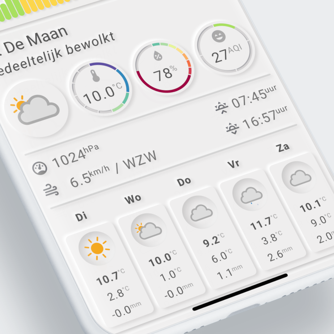
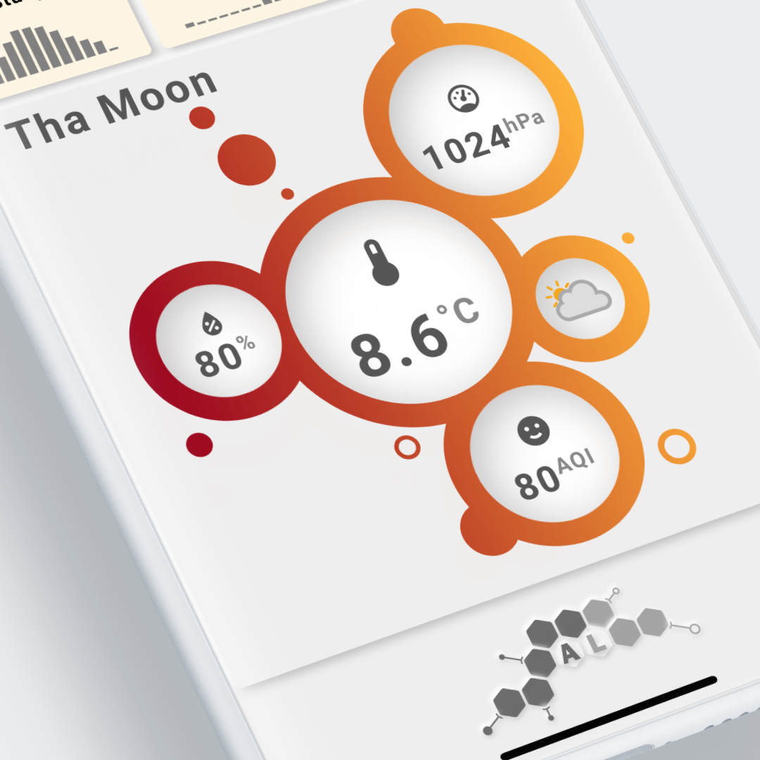
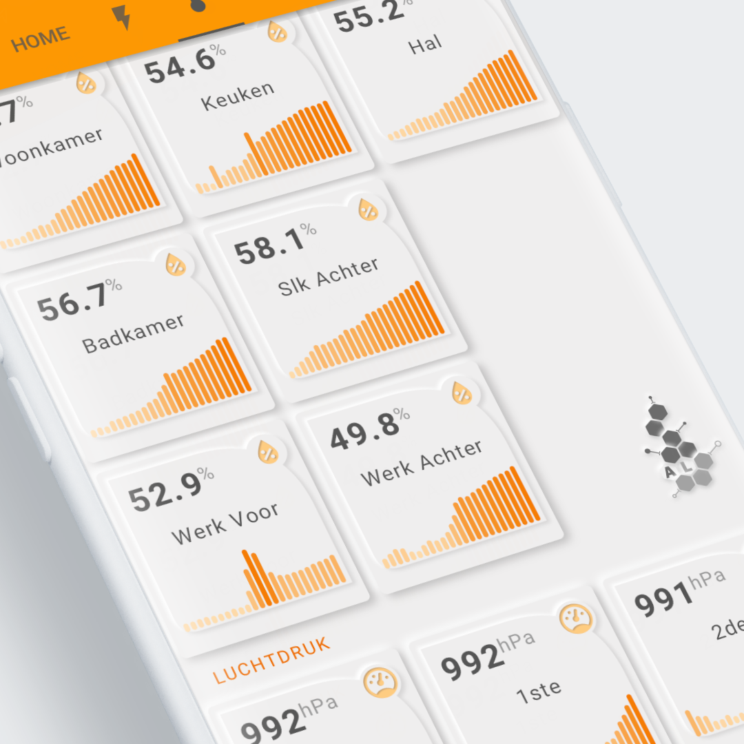
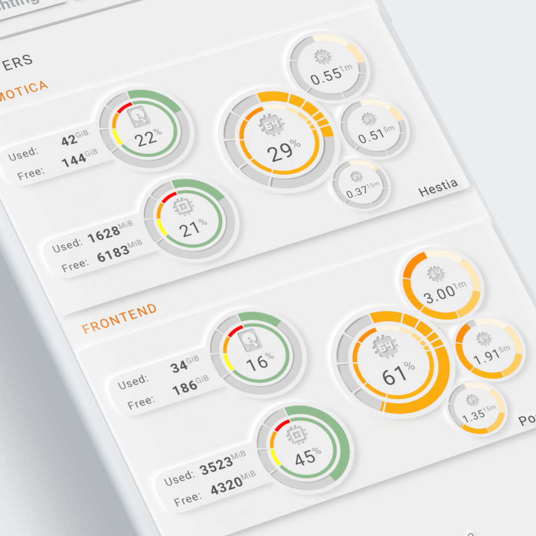
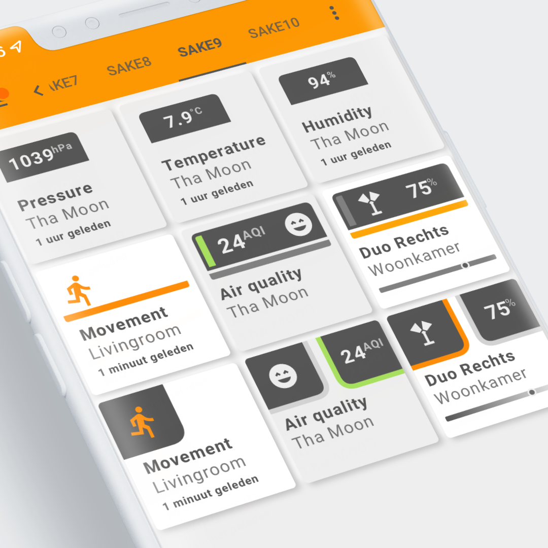
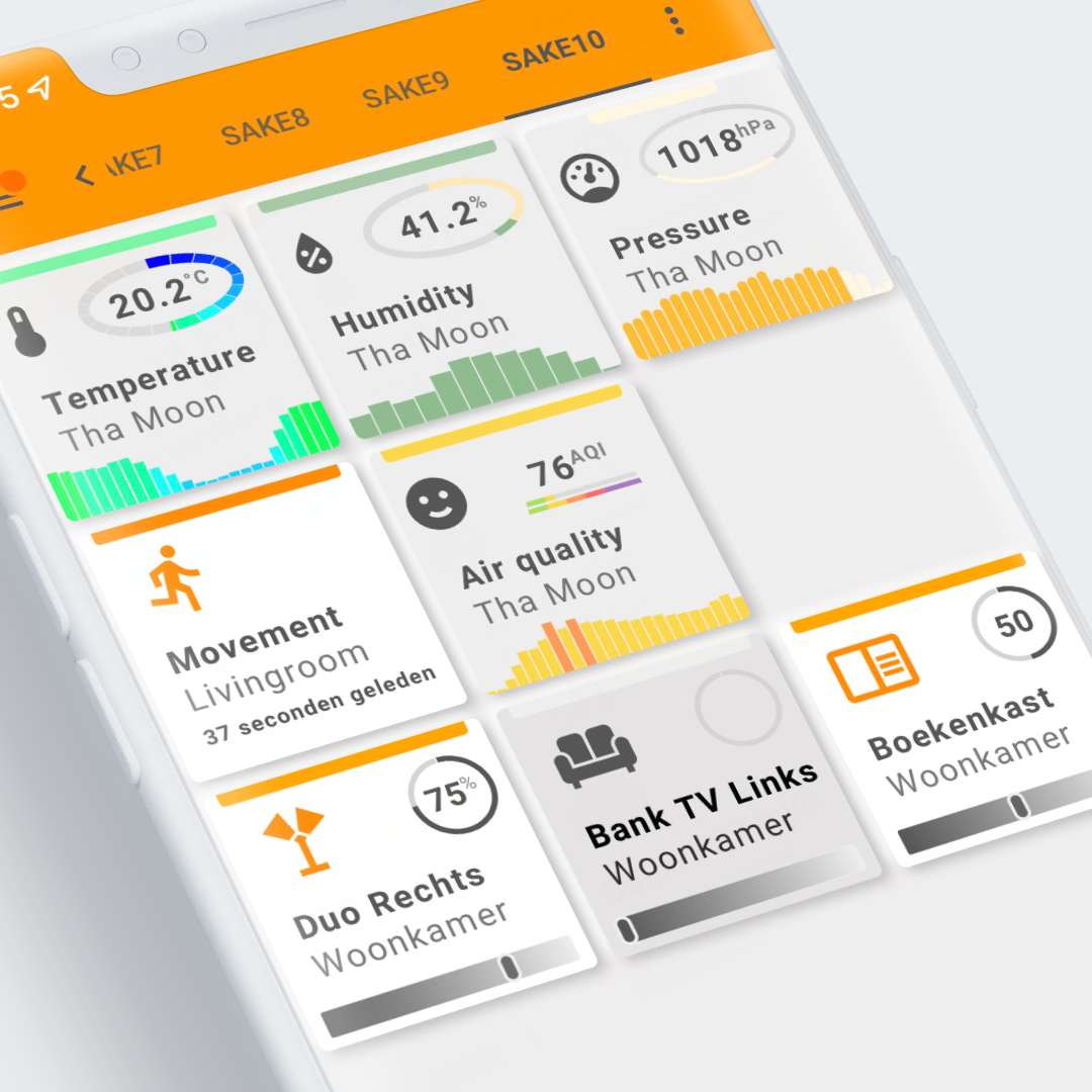
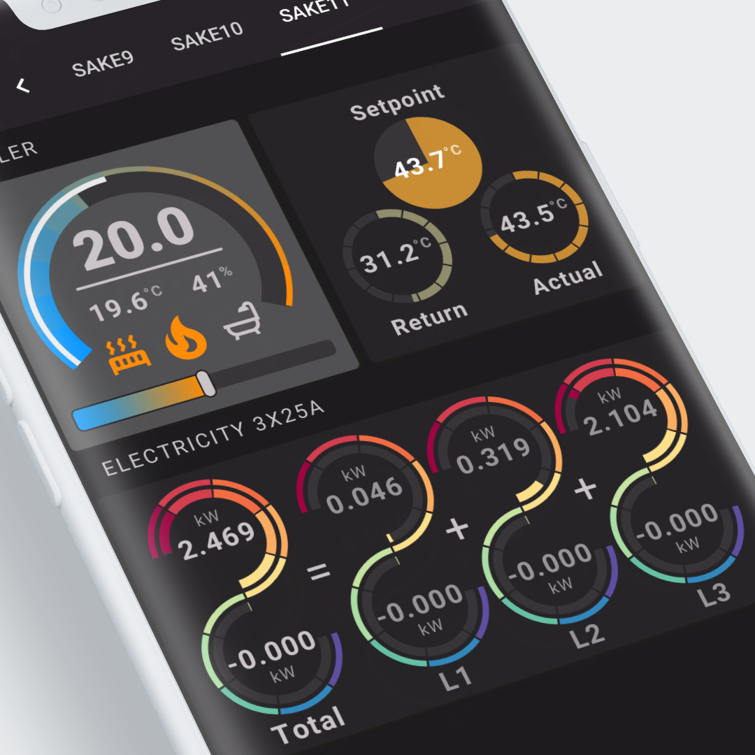
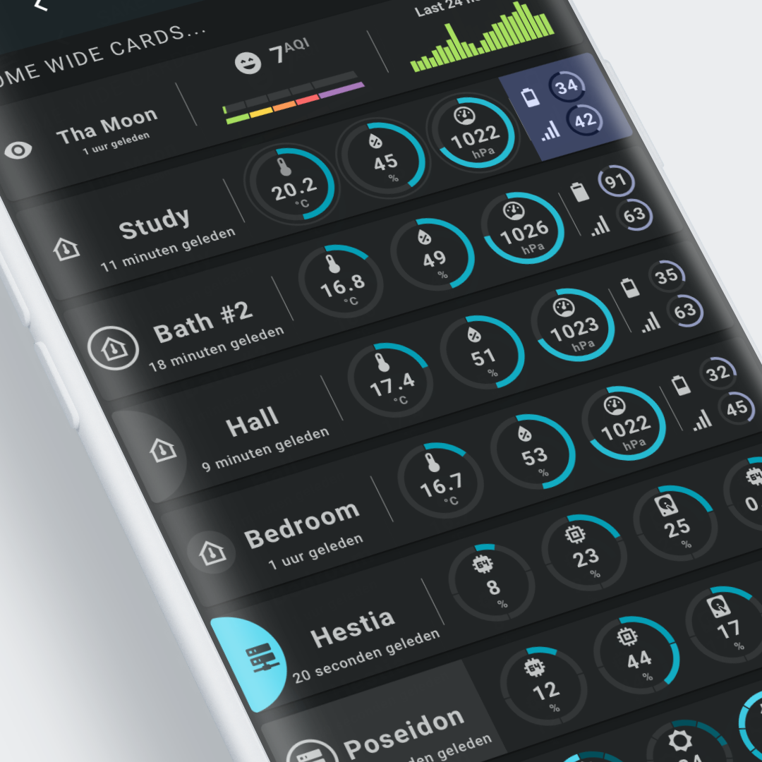
Well, if you look at some of the examples below (more are in the examples section), you literally see what kind of card this is: it is a versatile custom card that can be used to create unique visualizations!
To create your unique design, the Swiss Army Knife custom card has several tools for you to use which can be styled and animated in different ways.
YAML to define Tools, Toolsets, CSS styling and Animations
The designs are fully defined in YAML, and with the available 17 basic, advanced, and Home Assistant-specific SVG-based tools you can implement your visualization. 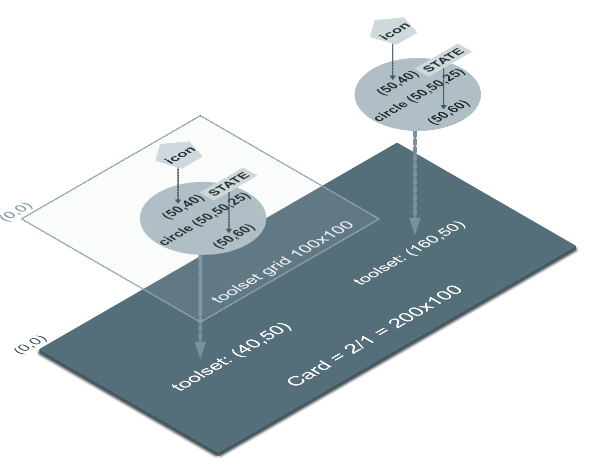
Things like templates make re-use between designs possible. On top of that, several CSS styling and built-in animation options are available. You can even define your own CSS classes and animations, and use them in your designs.
User interactions and haptic feedback
You can define user interactions per tool to call the 'more info' dialog or to control lights or switches. You can even define more than 1 action per tap action. Haptic feedback can complement the click/tap action if your mobile phone supports that.
Material 3 themes to have nice light/dark themes
If you want to make the most of this card's styling, use one of the Material 3 themes for Home Assistant. This gives you fully compatible light and dark themes!
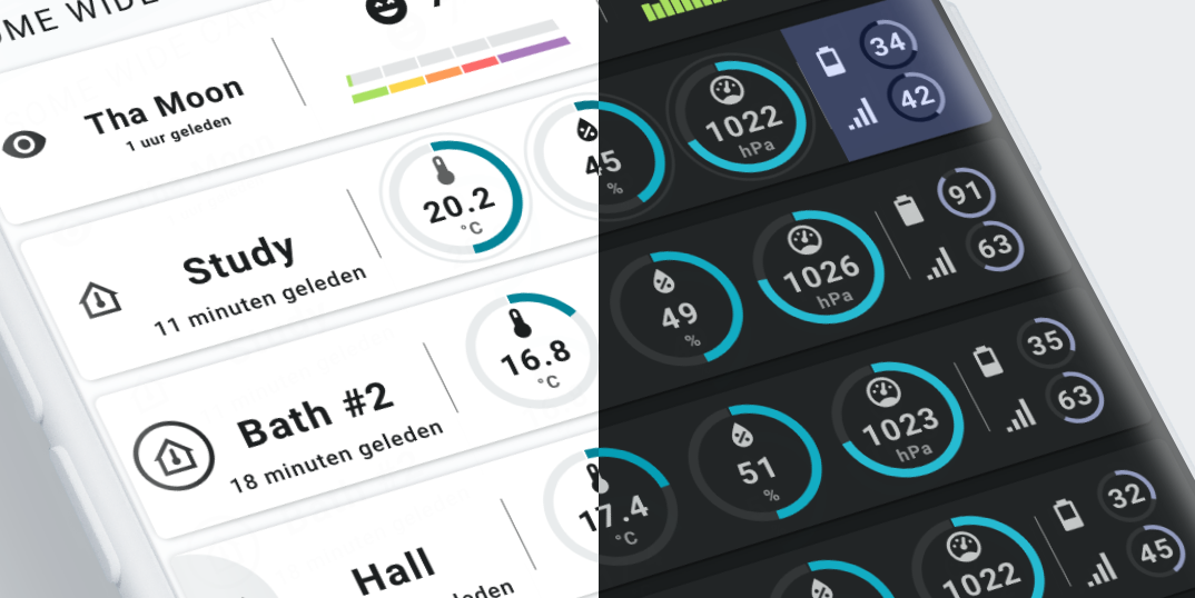
Swiss Army Knife card examples 11 and 12 use these Home Assistant Material 3 themes to implement cards that adapt to theme colors and to theme modes (dark/light).
Overview of all the examples
And for whom is it meant?
It is not a standard card. It has no fixed design, nor fixed functionality. It doesn't do anything out-of-the-box!
This card needs YOU. It needs some time to learn this card, understand its possibilities, and create a design. If that is what you want, this is your card. Let your creativity flow and enjoy the results!
If that is not your thing, you should look either at a different card, adapt one of the examples from my installation, or even better: use one of the examples made by me or someone else in the community!
And don't feel intimidated by the word "design". Most of my designs look like this: A simple sketch on my iPad that is later implemented in a YAML view using trial-and-error!
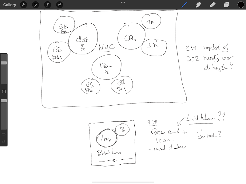
You don't have to design your card if some design suits you of course!
And if that card is put into a decluttering template for instance, you only have to define the entities for that card and some settings. In this way, a custom-designed card can be used as a fixed-layout card!
Example 3 for instance is made that way. The view contains these definitions:
| From: view-sake3.yml | |
|---|---|
1 2 3 4 5 6 7 8 9 10 11 12 13 14 15 16 17 18 19 20 | |
The electricity card in example 11 and the several cards used in example 12 could also be used in this way!
Either way, enjoy this card!
Where to go from here?
Because of the numerous possibilities of this custom card, you might wonder where to start.
The answer is: it depends!
If this is all a bit new, take a look at the 10 Step Tutorials (I just started making them, so there aren't a lot of them yet).
They will show you the basics, and some more advanced YAML configurations, and show you step-by-step how to make certain visualizations.
If you understand them, take a more in-depth look at the 12 examples.
Well, head over to the installation, and install the Examples Dashboard. Then integrate them using your own entities, and start learning from those examples!
The examples use different strategies:
- A lot of copy/paste YAML
- Swiss Army Knife Templates
- Decluttering Templates
