Introducing 12 examples
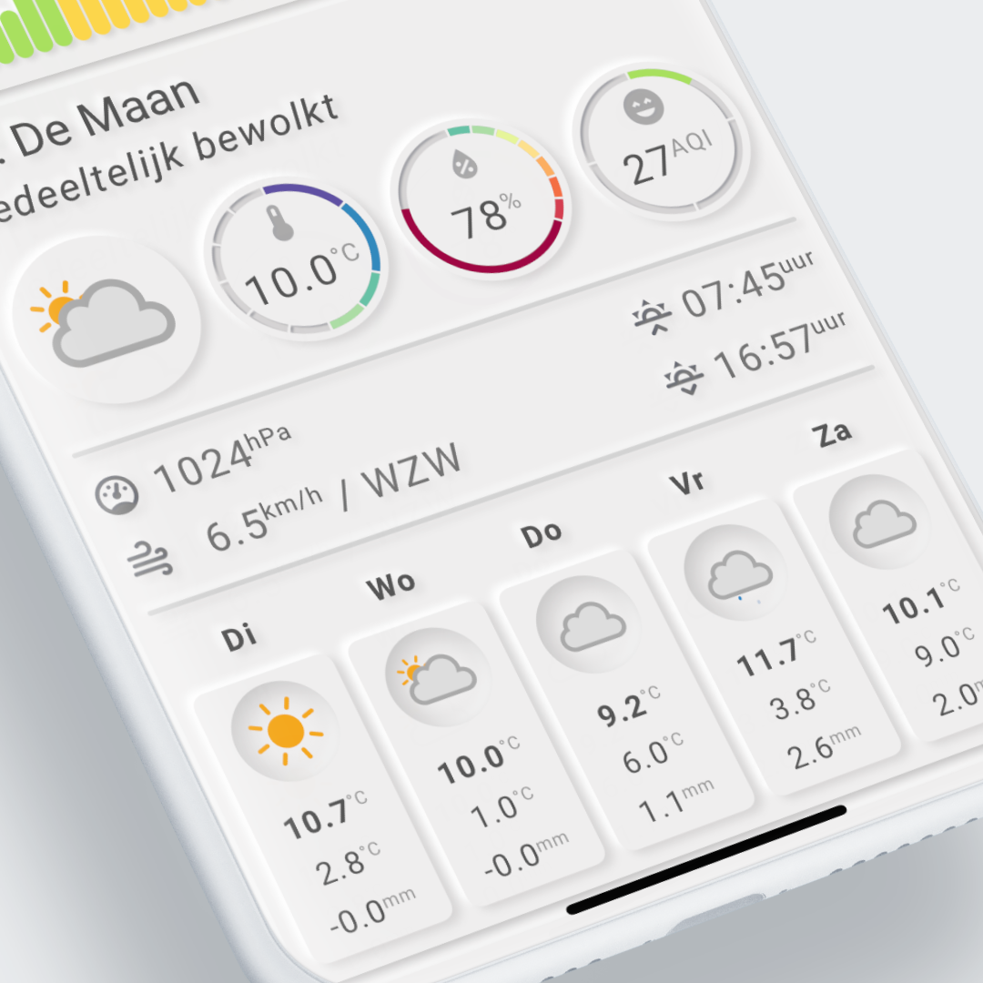
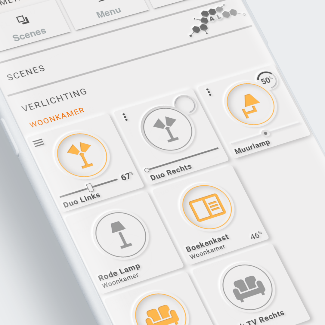
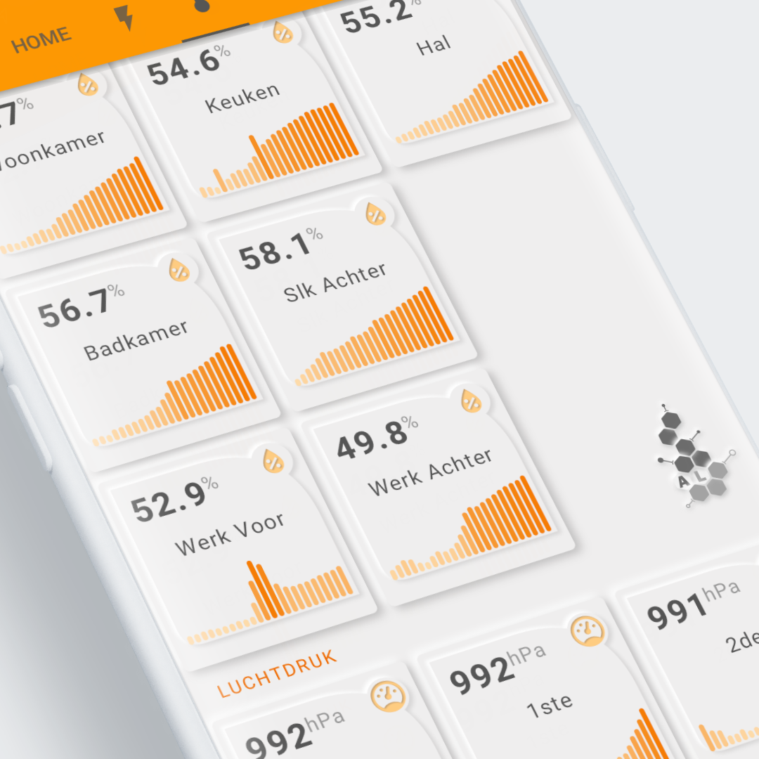
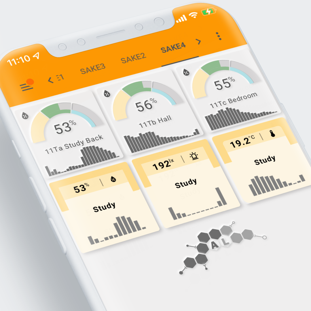
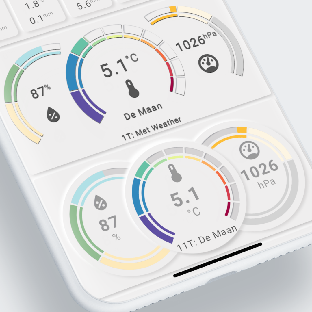
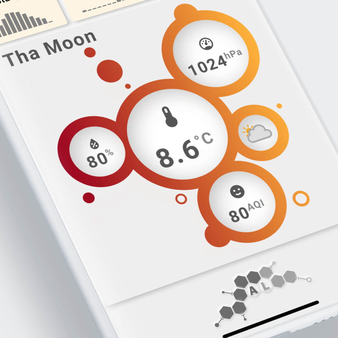
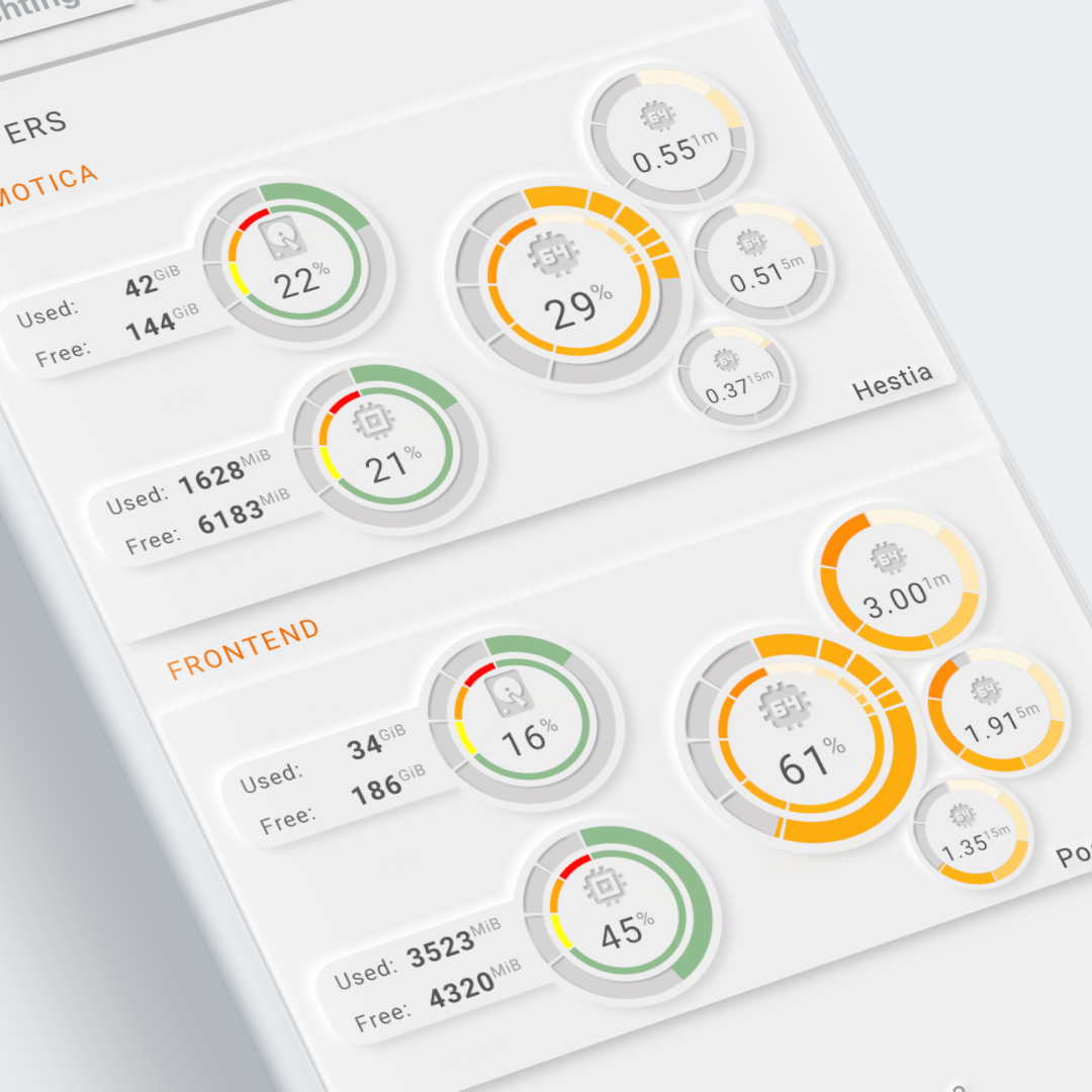
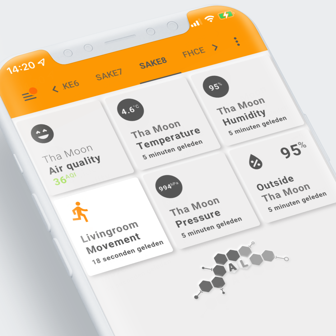
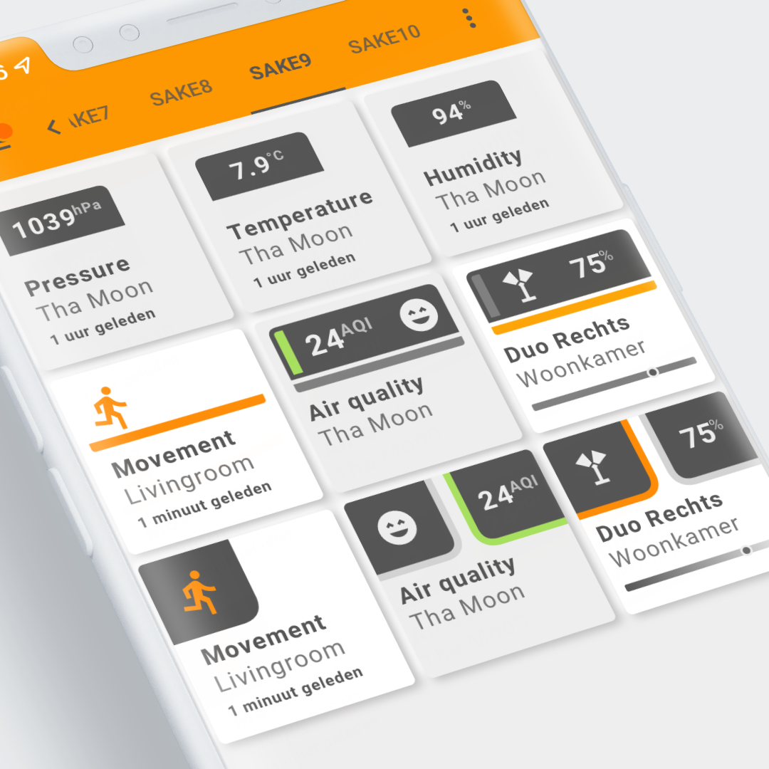
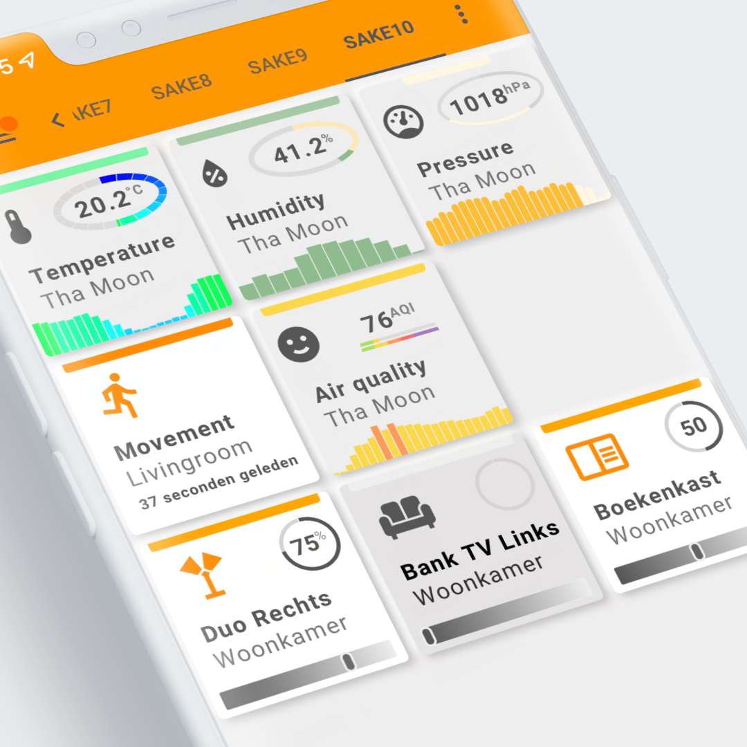
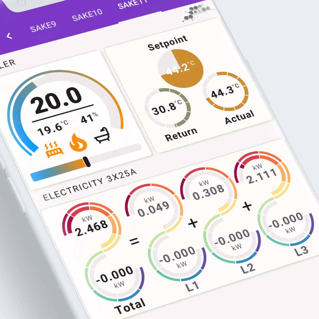
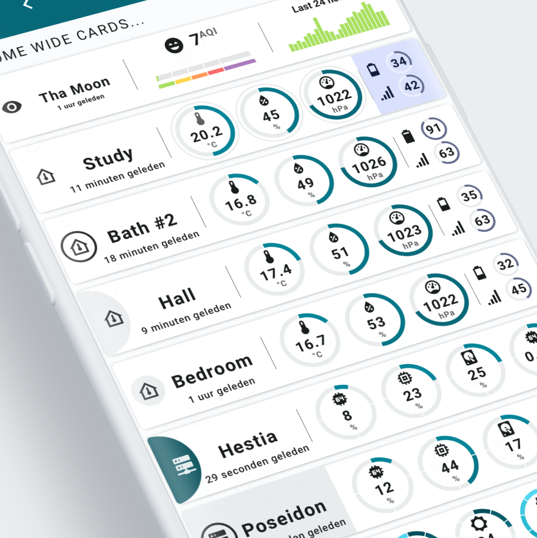
I have placed twelve examples in their own Swiss Army Knife custom card Example view for easy reference. In most cases, the examples show more than one map or more than one visualization.
Some use SAK templates, some use decluttering templates, some use both and some don't: they contain the entire configuration in the view itself.
All examples except 11 and 12 use their own theme defined in the view-sake*.yaml. Themes are on Github.
Aside from the box shading for the cards, themes also define some of the color schemes used by the cards.
Other themes may display black colors where theme colors are used.
Example 11 and 12 use a Home Assistant Material 3 theme
Example 12 is used as the example view to create the Material 3 themes. Check the examples section.
Real world examples from my own installation
All samples are actual screenshots of my iPhone, which are then added to an iPhone mockup in Affinity Designer, exported, and processed into an Instagram-compatible 1080x1080 pixel crop.
Many examples use the Met.no weather and Airvisual integrations. Each example also describes what you need to change in order for the examples to work in your installation. The above integrations are necessary in most cases to make things work.
| And some gifs to show the CSS animations | |
|---|---|
Example 2: 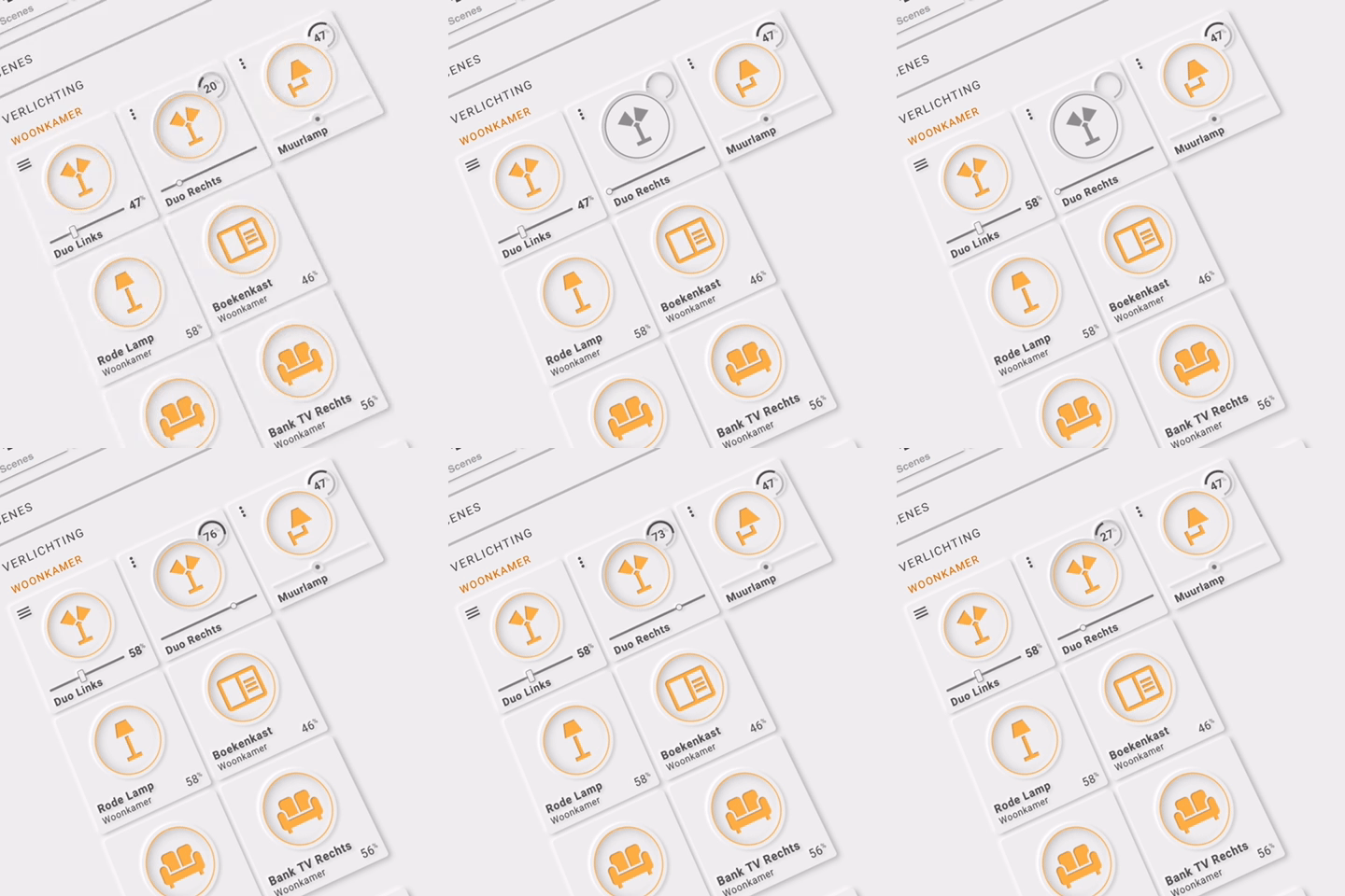 | Example 6: 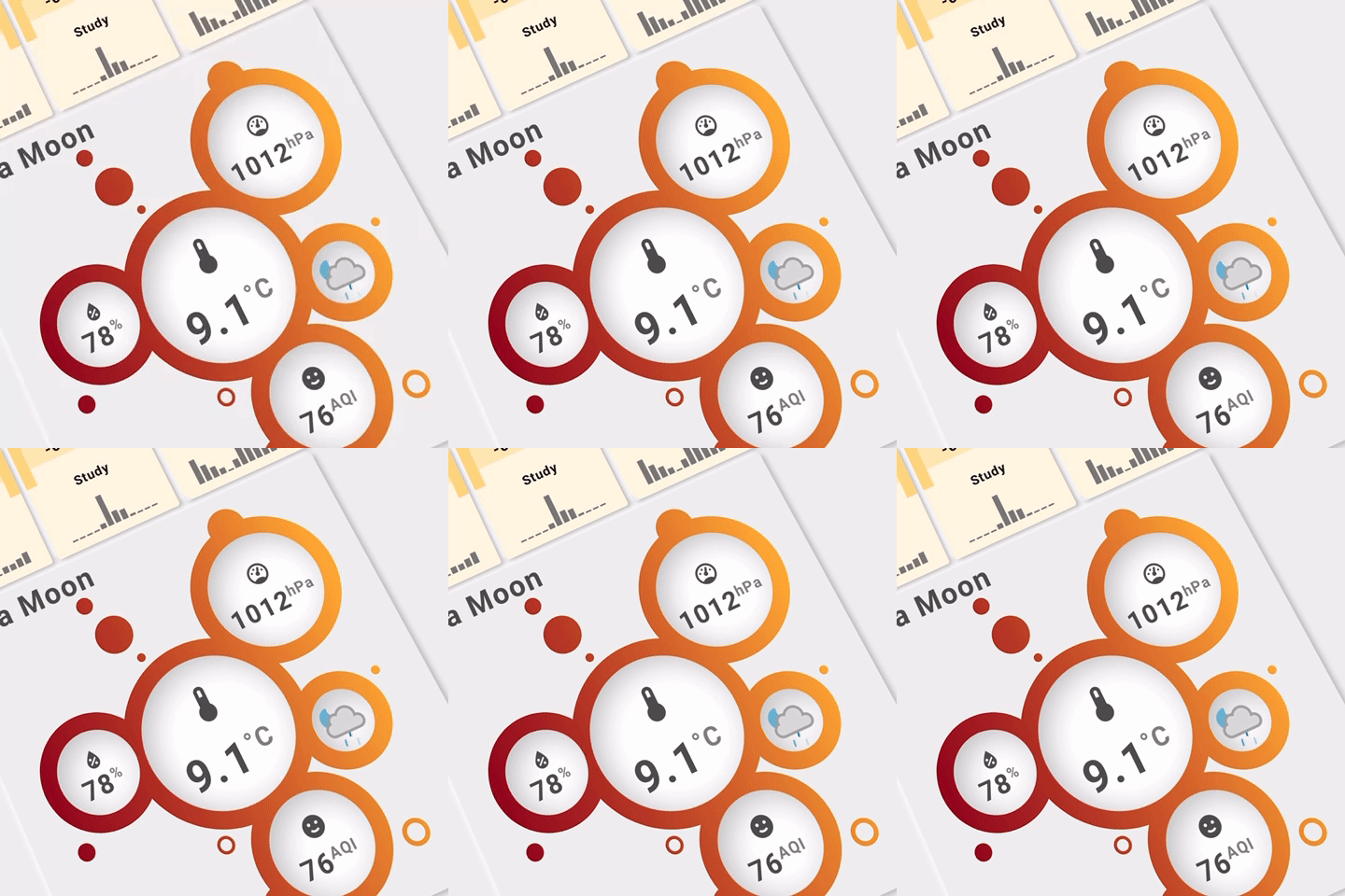 |
Example 9: 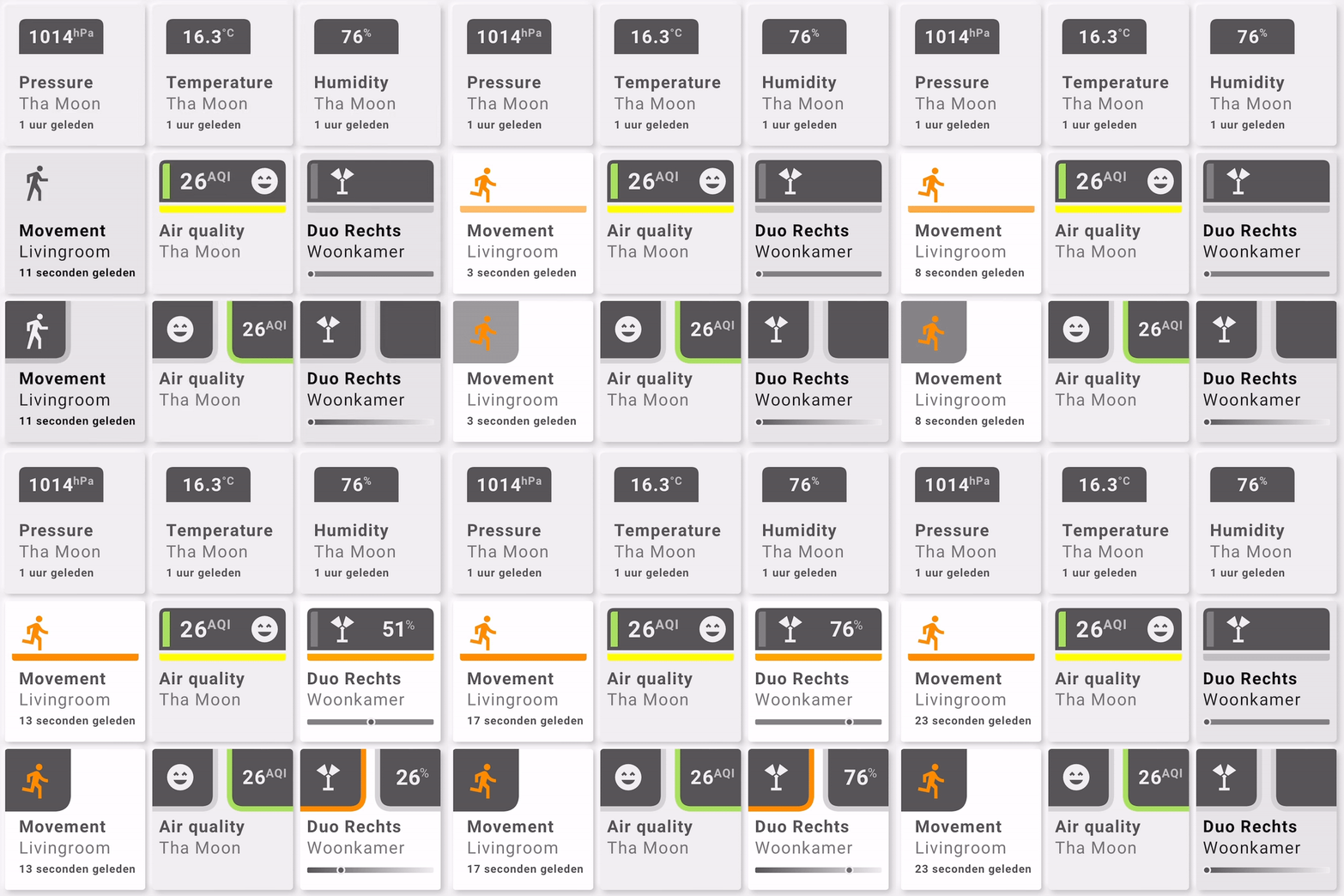 | Example 10: 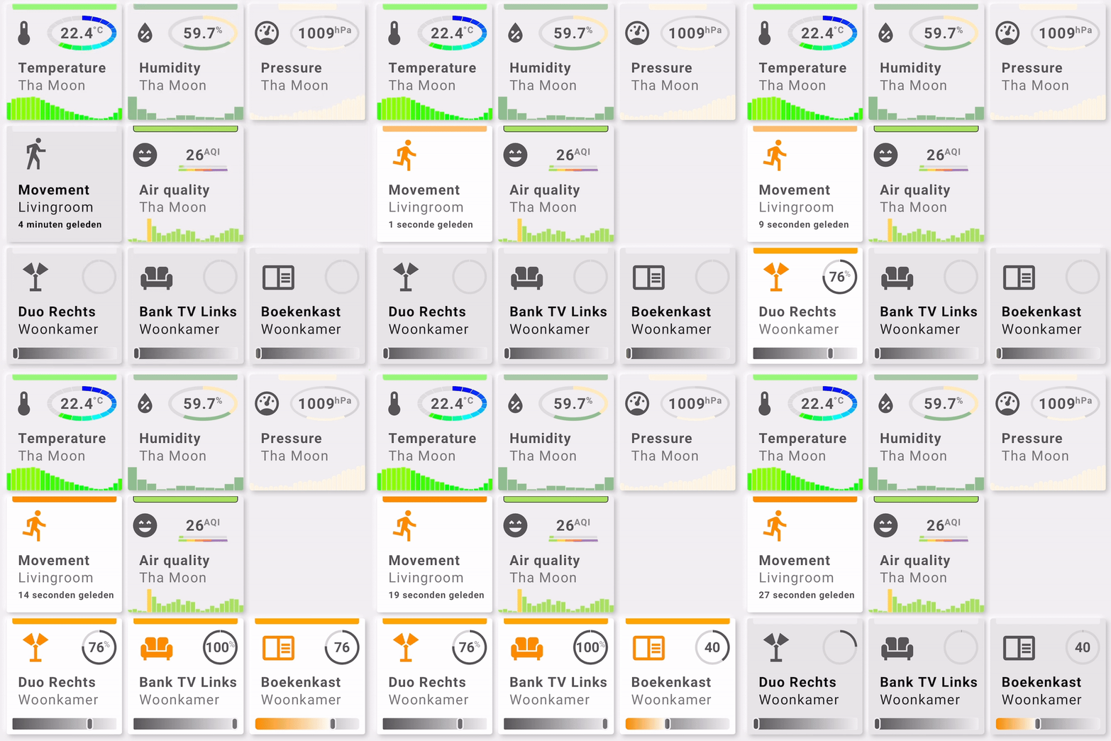 |
Platforms tested
I have tested SAK - and thus the examples - on the following platforms:
- Safari (mobile and desktop view) on iOS/iPadOS 14 & 15, iPhone & iPad
- Google Chrome > 90.x on Windows 10, on my 10 year old Desktop
By testing Chrome, I assume I validated all the Chromium-based browsers (Chrome, Edge, Opera, Vivaldi, Brave, Blisk, etc). That should also cover Android devices using Chromium-based browsers which I could not test as I don't have any Android devices. A quick view on a friend's Samsung showed no problems, but that is no 100% guarantee of course.
Due to the browser differences and long-standing bugs in Safari, some parts of SAK have different rendering paths for Safari and Chromium.
One notable difference between the two is the SVG filter implementation of Safari. It works but takes a small performance hit compared to Chromium, which has a better and faster filter implementation. Safari users will therefore see a difference between a switch to a view with filters (like a Neumorphic design) and a Flat design: the latter is faster with the initial loading of the view.
I update Home Assistant Container every few months, and try to keep up with changes in Home Assistant to adapt this card to these changes.
