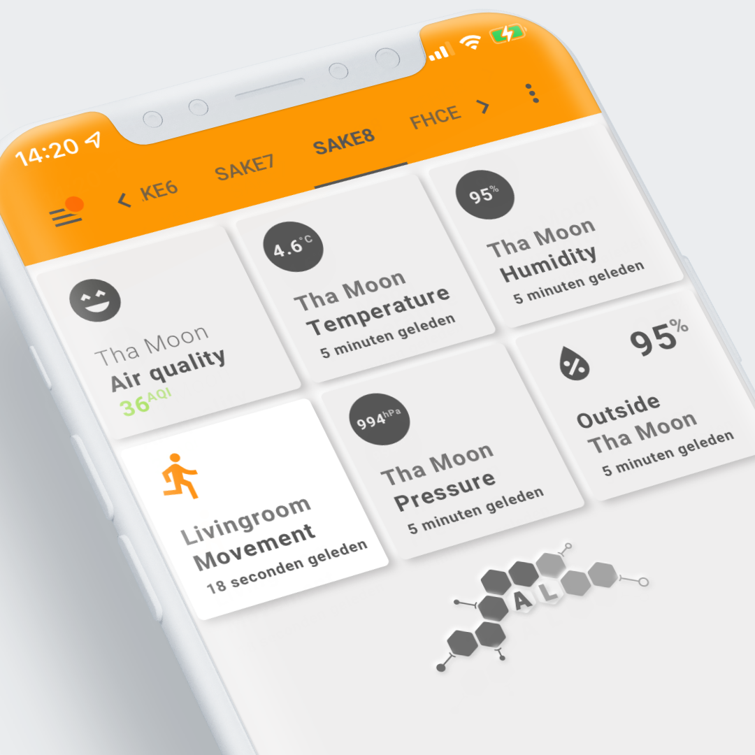
Example 8: Homekit alike cards

Visualization
Weather, Airvisual cards and one occupancy sensor card using Homekit alike cards with icon and card animations.
Cards 2, 3 and 5 share the same design, the others are different
Used Home Assistant Integrations
- Met.no Weather integration
- Airvisual integration
- Aqara Occupancy sensor using zigbee2mqtt, ie the MQTT integration
How to make it work in your own installation
Outside environment sensors
Required Home Assistant Integrations
The visualization is build on the Met.no generated entities, so you need the Met.no Weather integration
Required Home Assistant Entity Changes
The Met.no integration creates the weather.changeme entity. Adapt the changeme part to your own installation!
Other weather integrations won't work, as they create different states and attributes
Airvisual sensors
Required Home Assistant Integrations
The only integration you need are the Airvisual entities, so you need the Airvisual integration
Movement/occupancy sensor
Required Home Assistant Entity Changes
Last but not least: an occupancy sensor is used. If you don't have any occupancy sensor, replace it with any on/off sensor and the card should at least work!
Interactions
- All tools support by default the "more-info" dialog once clicked.
View and Card Configuration
Lovelace view
| file | location | included from |
|---|---|---|
view-sake8.yml | /lovelace/views | sak-examples-dashboard.yaml |
The 1st card on the 2nd row shows the use of some of the built-in CSS animations...
1 2 3 4 5 6 7 8 9 10 11 12 13 14 15 16 17 18 19 20 21 22 23 24 25 26 27 28 29 30 31 32 33 34 35 36 37 38 39 40 41 42 43 44 45 46 47 48 49 50 51 52 53 54 55 56 | |
Decluttering templates
None.
SAK templates
None.
Remarks
Due to rendering differences for icons, Safari based systems show the icon animation, and other/Chrome based browsers not.
This should be fixed in the future...