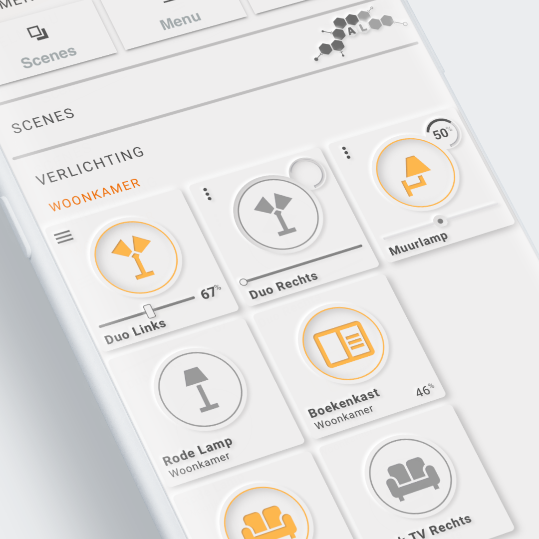
Example 2: Controlling Lights
Visualization of lights and interaction to switch lights on and off and to control brightness using a slider for the first row.

Visualization
Tip
This visualization shows some non-card alike aspects of the Swiss Army Knife: the horizontal divider lines, and the texts "SCENES", "VERLICHTING (Lights)" and "WOONKAMER (Livingroom)" are all made with SAK.
The first lights row shows some cards with different experimental sliders and a segmented arc to display the brightness. The other rows show a standard light card.
The light switch (all cards)
The light switch is made out of 3 circles and an icon:
- the 1st (bottom) circle is used to get the Neumorphic effect: a button that 'rises' out of the background. It also servers as the edge of the light button.
- the second circle is used to display the activation ring; orange if 'on' and light grey if 'off'.
- the third (top) circle is used to display the inset shadow effect as if the button is "pressed".
- last but not least: the light icon is displayed on top of all those circles.
First card
The first card shows a "more-info" button in the top left, the ligh button, the name of the light, and a slider with the actual percentage on the right side of the slider. The position of that value can be defined in the card.
Second and third card
The configurable position of the percentage is visible in the second and third card: apart from using a different styled slider, the percentage is shown in the circle where the segmented arc is also defined.
The rest of the cards
The other 4 - identical - cards show the light button, the area (Woonkamer = Livingroom), the name of the light, and if present: the brightness in the lower right corner.
Brightness is only displayed if the light is on
This is a change in Home Assistant some months ago.
Interactions
Sliders → Experimental
First row
The first row has an explicit "more-info" menu button and sliders for brightness
- The menu in the upper left corner calls the "more-info" popup for the light.
- Clicking the light icon toggles the state of the light. The circle behind the icon functions as a "button".
- Dragging the slider will set the brightness and update the lights brightness semi-realtime 4 times a second.
Other rows
- All cards displayed toggle the light by clicking on the light icon. The circle behind the icon functions as a "button".
All rows
- All cards displayed show the "more-info" dialog if name, area or brightness percentage is clicked.
Used Home Assistant Integrations
- Ikea Tradfri Zigbee lights using zigbee2mqtt, ie the MQTT integration
- Dumb on/off lights using MQTT.
How to make it work in your own installation
All cards
Required Home Assistant Integrations
The visualization is build on light entities that have a on/off state and a brightness. It does not depend on any specific integration. Any entity from the light domain with these entity/attribute should work
Required Home Assistant Entity Changes
Replace the light entities (state and brightness attribute) with your own entities
View and Card Configuration
Lovelace view
| file | location | included from |
|---|---|---|
view-sake2.yml | /lovelace/views | sak-examples-dashboard.yaml |
This example uses decluttering templates for all cards except for the first row of lights!
Both SAK templates and Decluttering templates are used to display the cards. This view is therefore as compact and easy to read as possible and is a good example of re-use.
Decluttering templates
Decluttering templates are used extensively in this view except for the cards on the first row.
The following templates are defined in /lovelace/decluttering_templates/decluttering_templates.yaml file:
- The
header_templateis used for displaying the header sak card - The
divider_templateis used for displaying the divider line sak card - The
sak_button_template_nm_tplis used for displaying the light card
Excerpt of the headers and dividers in this view...
1 2 3 4 5 6 7 8 9 10 11 12 13 14 15 16 17 18 19 20 21 22 | |
And the excerpt of the lights on second and third row...
1 2 3 4 5 6 7 8 9 10 11 12 13 14 15 16 17 | |
Excerpt of the decluttering_templates.yaml file...
1 2 3 4 5 6 7 | |
SAK templates
The following templates are defined in the /lovelace/sak_templates/sak-templates.yaml file:
- The
toolset_light_button_nmis the template used for the standard lights (second and third row of cards). - The
toolset_light_button_slider_nmfor the first card on the first row. - The
toolset_light_button_slider3_nmfor the second card on the first row. - The
toolset_light_button_slider2_nmfor the third card on the first row.
Excerpt of the sak-templates.yaml file...
1 2 3 4 5 6 7 8 9 10 11 | |
Remarks
- Home Assistant sends a brightness value between 0..255.
A little piece of javascript in the card converts this to 0..100% as a derived state, including a unit of measurement setting of "%". This means that the value and the uom can be styled as if it is an existing state.