How to design your card
Where to start?
So, you came here to read how to design your own card. That's good!
If you're a graphic designer or some UX guy/woman, you will probably have tons of ideas, and after understanding the possibilities, you immediately fire up Adobe Indesign, Affinity Designer, Inkscape, or Procreate on your PC/Mac/iPad or went online using Figma or some other online tool to sketch your design.
You're one of those people:
The nice thing about the Swiss Army Knife is that you can design your own card.
But not everybody is a graphical designer, so how to approach designing a visualization in that case if you're one of the below people?
The bad thing about the Swiss Army Knife is that you do need a design for a card.
Get inspired!
If you browse the internet you can find all sorts of visualizations. I just picked 3 as an example:

- The left one is a simple flat design with no fancy stuff on it if we forget the waves in the background.
- The center is based on a Neumorphic design. I used that for some of the examples. You probably recognize the typical discs! By the way, the shadows in this example are a bit exaggerated for my taste. I've used more subtle shadows in the examples.
- The right one resembles a Homekit-alike design. It's clean and simple.
All three are completely different designs, and all three can be build using the Swiss Army Knife card!
Of course, you can't build them EXACTLY that way, but you can come a long way mimicking these examples.
You will find several designs in the examples
About half of them use a Neumorphic design, and the other half flat and Homekit alike designs.
Ok, I got inspired. Now what?
Well, you can try different approaches.
- Re-use an existing card and modify this to your own needs to design your own card
- Re-use some existing design you found on the internet to design your own card
- Create something completely new and have a unique card design
Most of the possible card visualizations have been created I think. So taking inspiration from something you found on the web and using that as the basis for your cards is a tried and true approach.
Once you've decided what style you want, you can start designing your cards. You can choose the simple approach or a more professional approach:
- The simple approach of "outlining something" and then trying to make it using trial and error in YAML
- Create a real design in an app on a 100x100 artboard and then create the card using the dimensions and coordinates of the design
The easy approach: hand sketching some design
I used this a lot and created about 50 of these sketches in Procreate on my iPad. Only some of them made it in production. Many were not useful, too complex to make, or just ugly.
Below you see one of those sketches. It shows a pre-version of the server example (See: example 7) and a production example of the lights (See: example 2). Not yet Leonardo da Vinci quality, but I'm learning. At least my handwriting is on par with a doctor 

I then use this sketch as the basis to create the card. It took some guessing about coordinates and sizes. I use Notepad++ as an editor to produce the YAML. After every "save" action, I hit F5 to refresh Home Assistant's view to check if I'm satisfied with the result. If not, rinse and repeat...
The server card took a lot of trial-and-error to get the 4 CPU/Load circles aligned the way I wanted to:

The lights were much easier, as it involved much less parts:

The professional approach: using an app
Below you see Affinity Designer in action.
For example 6, I wanted to create something different with circles as the background, and on top of that some SAK tools (circles) with weather and airvisual data.
The design is for a square card, so I created an artboard with a size 100mmx100mm. This is the default 'coordinate' system for a square card. As a result, the coordinates shown by Affinity Designer can be copied 1:1 in the cards YAML definition. No trial-and-error this time placing the tools at the right location.
The units used are NOT relevant, it's all about a 100x100 canvas. Use centons if you like...
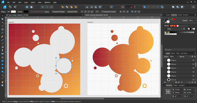
As an example, I selected one of the circles where the weather type will be put. In the lower right corner of the Affinity Designer screen, you can see that I selected the center coordinates and (if you look closely) that the X coordinate is 77 (mm) and the Y coordinate 59 (mm). You also notice the width/height for the circle is 22 (mm).
The resulting partial YAML definition is as follows:
1 2 3 4 5 6 7 8 9 10 11 12 13 14 15 16 17 | |
And the final result after placing all the SAK tools (circles, entity icon, entity state, and weather type) on top of the background: a nice visualization, a bit artistic, clean, and showing a fair bit of information. The gradient also gives a nice touch to the overall look & feel.

A word on Theme usage
If you want your design to work in both Light and Dark theme mode, make sure you use theme colors for the implementation of your design.
Swiss Army Knife examples 11 and 12 use my Home Assistant Material 3 themes to implement cards that adapt to theme colors and to theme modes (dark/light).
Enjoy!