Coordinate system
The Swiss Army Knife map uses a easy to understand coordinate system to simplify the design and placement of toolsets and tools on a card.
Basics
The coordinate system of a SAK Card is based on the following characteristics:
Card:
- A SAK Card has a configurable
aspectratio - That aspect ratio determines the internal grid size:
aspect ratio * 100.
Toolset & Tools:
- A Toolset has a default 100x100 grid size. It does NOT depend on the size of a card.
- The top-left is the origin (0,0)
- The center coordinates of a toolset are (50,50)
- All tool dimensions are relative to the default toolset grid size: a line with a length of 10 means 10% of this default grid.
The next paragraph shows an example, and the paragraphs thereafter more details.
An example: Toolset and tool placement @ work
Now we know the basics, let's look at the example with a card size of 200x100 (2/1 aspect ratio) and two identical toolsets consisting of a circle, icon, and state.
The tools are neatly configured around the center position (50,50) of the toolset grid:
- the
circleis placed at (50,50) with its radius of 25, - the
iconis placed at (50,40) and - the
stateis placed at (50,60).
The first toolset is placed at (40,50) on the card, and the second toolset at (160,50) on the card.
In a kind of 3D world, it looks like this: 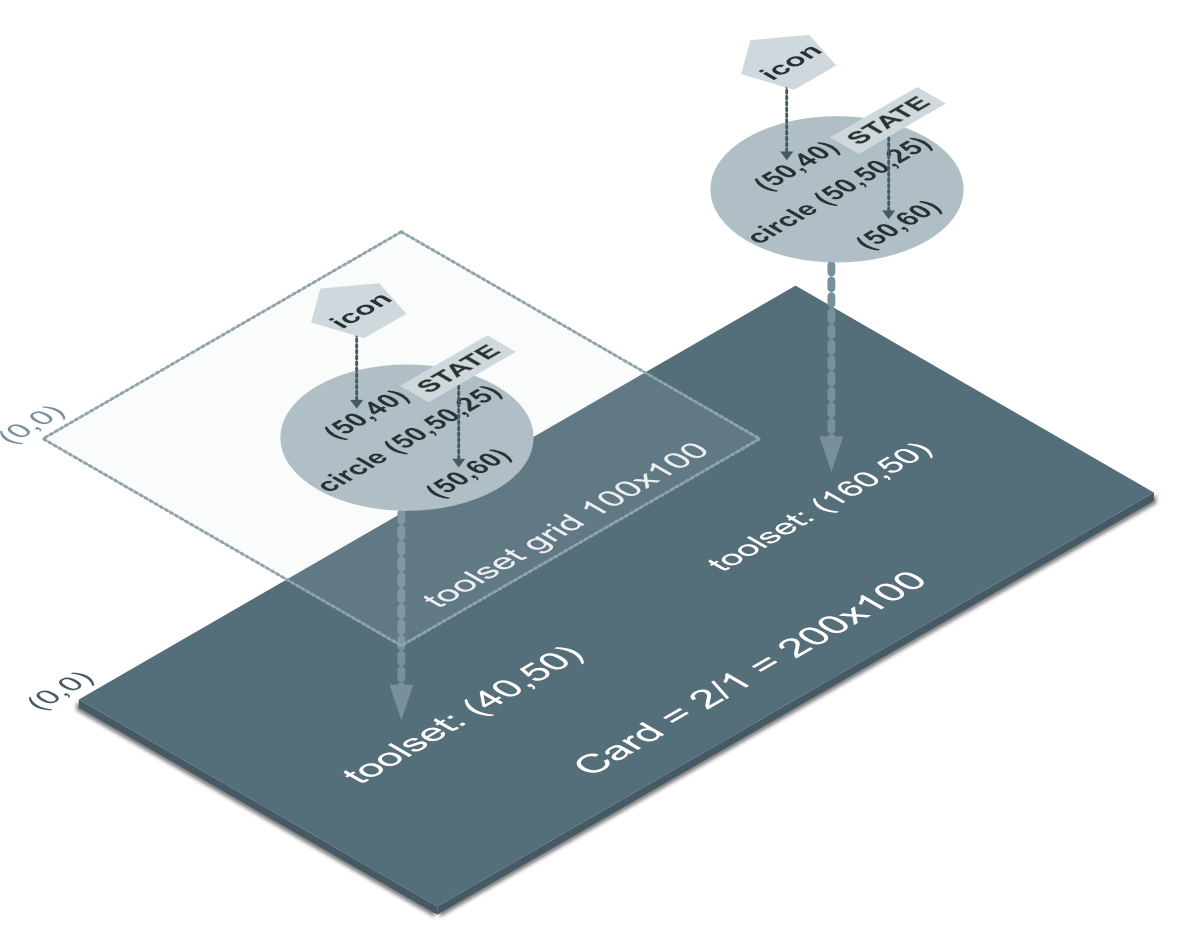
The YAML configuration is shown below. Here you see the toolsets (named set1 and set2) and the different tools: circle, state and icon. For brevity only the coordinates/sizes part is shown.
1 2 3 4 5 6 7 8 9 10 11 12 13 14 15 16 17 18 19 20 21 22 23 24 25 26 27 28 29 30 31 32 33 34 35 36 37 38 39 40 41 42 43 44 45 46 47 48 49 50 | |
More indepth: Card aspect ratio and size
Below you see the configuration of a 1/1 square card which equals a grid size of 100x100.
- type: 'custom:swiss-army-knife-card'
  aspectratio: 1/1        # Square 1/1 card with resulting 100x100 grid size
Example cards with different aspect ratio's
Some examples for aspect ratio's and (grid size) of: 0.5/1 (50x100), 1/1 (100x100), 2/1 (200x100) and 3/1 (300x100):
You are not limited to these aspect ratio's. Any aspect ratio will work
But what about the internal grid size then?
If I would place three square cards in a horizontal-stack with different aspect ratio's, I get three equally sized cards. All cards scale to the same actual size in pixels, independently of their internal grid sizes of 100x100, 200x200 and 400x400.
The result of these different internal sizes can be seen in the following example: I "designed" a toolset with a single circle on a standard 100x100 canvas and placed the toolset for each card on the same position (50,50); The circle scales to the actual grid size of the card. Scalable Vector Graphics at work!
The 1/1, 2/1 and 3/1 are mostly used for mobile phones, and the much larger ones, say 4/4 for panels
The tools on a 4/4 would be too small to read on a mobile phone, but are excellent on large displays.
More indepth: Toolset aspect ratio and size
As already mentioned, the position and dimensions of a tool always reference a default toolset grid size of 100x100:
- (0,0) is the upper left corner of the grid
- (100,100) is the lower right corner of the grid
- (50,50) is the center of the grid and servers as the 'anchor' used by the Toolset to position the tools on a card.
Furthermore, all dimensions are relative to the grid:
- a line with a length of 10 takes 10% of the grid.
- a circle with radius of 50 fits exactly the grid.
The size and position of tools are not limited by this grid size!
So:
- a tool can be wider and higher
- a tool can be placed outside these default coordinates: so coordinates can be < 0 or > 100.
This means that - without scaling - such a toolset does NOT fit a 1/1 card!
Such toolsets are therefore designed for larger cards.
Don't forget that toolsets can scale tools and are re-usable if defined as a template
Use relative sizes for styles too, where possible
The dimensions of the tool are relative. Therefore, it is recommended to also use relative dimensions for styling. A simple example is the CSS font-size attribute: use em and not px to configure the size of a font, ie use font-size: 12em.
SAK has set the default font-size for SAK cards to be about the same size as 1% of the grid: so font-size: 10em should equal 10% of the grid.